My previous posts about headshots have focused on the type of shot that’s right for you and how to get it. This post will focus more on issues that come up after the images have been captured. This includes topics like image selection, image cropping, and image size/format.
How Many Final Images Do You Really Need?
At this point, let’s assume you’ve made all the right choices about the style of portrait that was created, and your clothing and grooming were all perfect too (see Part 1 and Part 2 for more on these parts of the process). Now there are probably 20-50 functional images ready for you to review and make your selection(s). How many do you really need for final use? Typically, the right answer is “1”. The most valid exception to this is “2” and that’s usually one shot that’s more formal and one that’s more casual. And typically, the formal/casual aspect is controlled by clothing. For men, this often means a shot with a tie and another without. As the photographer, I’d love for you to pick as many as possible because that usually means more profit for me, but the reality is that people don’t typically USE more than one or two. Your final choices will be processed and retouched and that’s the main reason why the cost goes up when additional images selected. Retouching takes considerable time and skill at the computer (hundreds of mouse clicks) and it makes you look your best. My process and pricing usually includes one retouched image with the basic fee but allows the client to download lower-resolution un-retouched images from the gallery at no additional cost.
Use a Gallery to Make Your Selection
How do you make the selection of which image to use and have retouched? Some photographers and clients suggest making your selection at the end of the photoshoot. I’m not a fan of this process because it often results in a rushed selection that the client later regrets. Whether the images are viewed on a tethered monitor or the back of the camera, it’s still usually a rushed process. A better approach is to use a private web gallery to make your selection over a week or two. Many people find it helpful to get input from friends and family. My recommendation is to make your selection based on the merits of the image as a whole. I mean, clients often select their final image based on the absence of tiny things that bother them. For example, perhaps there’s something imperfect about their left earlobe so they reject shots showing their left side. Typically, viewers of the image will never notice the little thing about which the subject is so sensitive. And viewers are NOT going to download the image and zoom in to 1000% to inspect for flaws. Instead, they will view it for 1-2 seconds at the size that it’s displayed on their screen. Then they will form a quick impression, such as “professional,” “approachable,” “strong,” “smart,” or “confident.” So don’t choose an image to represent you that’s lifeless just because it’s the one that hides your imagined “faults.”
The Crop
A “crop” is the process of selecting the section of the image to use and eliminating the rest. This is a critical step but is often difficult for clients to decide upon. Luckily, most clients are one of several being photographed at their firm and yours will be cropped exactly like your peers. This is not saying that you are the same as everyone else, but that consistency reflects well on any company. The key elements of a crop are the overall proportions and how much of the image is taken up by the face. Proportions are not the same thing as size. Size is absolute, like 8×10 inches. Proportions refer to the ratio between the length of one side of the image to the other side (written as side1:side2). Typical proportions are 1:1 (square), 2:3 (same as 4:6), 4:5 (same as 8:10), 5:7, but anything is possible (even a circular crop). These proportions harken back to common photo print sizes, like 5×7 or 8×10 inch prints. Finally, non-square headshot crops are typically oriented vertically – not horizontally.
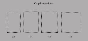
The approximate crop you are seeking is good to know before you are photographed. The photographer should always capture the image with a little extra space around the edges to allow a good range of cropping options later. But too much extra space around the edges means there are less pixels devoted to the face area and quality can suffer if you later crop in tight to the face and also produce a large output file.
Once the proportions are set, it’s a matter of deciding how much relative space the face should occupy in the total image area. Making this choice is partly practical and partly a matter of taste. The practical side is that you don’t want a shot with lots of body if it’s going to be displayed at thumbnail size because the viewer won’t be able to see your face well enough to identify you or form an impression. The “taste” side is more about intimacy and formality. I think the most common crop allows the face to take about 50-60% of the vertical space in the image. A crop that is very tight (close-in) and uses almost all the vertical space for the face is sometimes more intimate, unless it’s just a mug-shot style badge photo. When the client doesn’t have a preference, I select 4:5 proportions, vertical orientation, and about 60% of the image devoted to the face.
Image Size and File Format
Image size refers to the absolute size of the image, which is different from proportions that were discussed above. In the old days, the size would refer to print size (eg, 8×10 inch paper print) but now it’s the digital dimensions that are most relevant. The unit of size for an image in the digital world is pixels. A modern LED screen is made up of thousands or millions of individual points of light, also known as picture elements or “pixels”. My iMac screen is a “5K” screen that is made up of 5120 columns of pixels and 2880 rows of pixels. That means the image you see is really made up of 5120 times 2880 or a total of 14,745,600 individual spots of colored light. The greater the density of pixels, the more photo-realistic the image will appear. Imagine if you had to display a portrait with only 14 pixels instead of 14 million pixels. The same concept applies to the image files you are sending to the display screen.
Image files are specified in pixels too so you want to roughly match the pixel dimensions of the image file with the pixel dimensions that will be allotted to it on the website. When you see a little thumbnail-sized image on the screen, it’s probably displayed in a box that’s defined as approximately 150 pixels tall by 100 pixels wide. The image assigned to that space should ideally be the same size or slightly larger (more pixels). If you assign an image less than 150×100 to that space, it will look grainy and rough. If you assign an image greater than 150×100 to that space, it will generally look ok unless it’s a LOT bigger than the space allowed. In that case, it may actually look less sharp and it is likely to be slow to display on the screen.
It’s common on the About page of company website to see a list of company leaders with a small clickable thumbnail image that links to another page with a full page bio and a larger image of the leader. Not only is the image larger but it might also be a different crop with different proportions than the thumbnail version. This is a more elegant presentation for your company and the executives. The image on the full bio page might be a quarter of the screen so that file should be larger too (e.g., 2000×1600 pixels).
If you’re coming to the conclusion that you might need more than one version of the same image, you are not wrong. Some of my clients request two versions (one large and one small). One client requires 7 versions with specific crop proportions, image sizes and image formats for each version. That can be a lot of work (especially if a lot of people were photographed) so I charge that client a production fee too. Most commonly, I deliver only one file and it’s a fairly large file (typically around 2400×3600 pixels and 3-5 megabytes in size (much larger and it becomes cumbersome in many ways). By delivering one large high quality master file, the client can use it to create copies that are then scaled down and/or re-cropped to serve any need that comes up in the future.
Finally, file format needs to be specified too. There are many many wonderful graphic file formats (PSD, TIF, JPG, PNG, etc.) but in today’s digital world you want a format that is web-friendly unless your ONLY goal is to make a large, high-quality paper print. JPG and PNG are the most common formats in which I deliver headshot images to my clients, and I use JPG a lot more than PNG. JPG is compact (uses mild compression to reduce file size without sacrificing much in quality) and is compatible with just about everything. PNG is mainly used when you need the background of the image to have “transparency,” which allows the background of the webpage to show thru the transparent area of the image file.
I hope this has helped you understand some of the issues that are important to understand after the photography is over. Making good choices in these areas will assure your great new headshot will look great it’s displayed to others.
In Part 1 of this blog post, I talked about how to choose the type of corporate portrait that’s right for you. In Part 2, I’ll discuss a few issues that are common when considering any type of business portrait, such as clothing choice, styling, and retouching.
“What should I wear?” is the most common question I’m asked by my clients. There’s no right answer to this question but I do have a guiding principle: Clothing should not distract the viewer’s eye from going directly to the subject’s face. Typically, this means controlling the amount of strong colors and patterns in the clothing you choose.
If you saw a headshot of a man wearing a red sport coat, can you guess where your eyes would go first? I bet you’ll agree it would not go to his face. How about if he wore a black sport coat with white stripes? In this case the black color is fine but the pattern attracts our eyes this time. How about just a plain white dress shirt (no coat)? Certainly, that can’t be a problem? Actually, surrounding your face in a large area of a very light color also attracts the viewer’s eye. (And there can be other unflattering side-effects of that choice too.)
So what works best? For men, I recommend a non-patterned dark sport/suit coat with a crisp light-colored shirt underneath. Why does the light-colored shirt work now when it didn’t work on its own? Answer: Quantity. You’re only seeing a sliver of the bright shirt now. Also, the part of the shirt that’s visible is forming the shape of a triangle (a powerful shape in visual design) that leads the eye directly to the face. And the dark coat is what’s called “negative space” in design terms; So the dark coat is less about formality more about surrounding you in something in which the eye is not very interested. Finally, what about a tie? Since it’s not a huge piece of cloth, you can get away with a tasteful splash of color and pattern here. It’s a great accent without being too distracting. You can present a very professional appearance with or without a tie. Of course, that assumes that your coat looks good and the shirt is crisp, well fitting, and reasonably new (ie, no pills!).
Women have a little more latitude than men when it comes to clothing choices that work in a corporate photo, but the same principle still applies (ie, what you wear should not distract). Typically, women can wear more color and pattern than men before it becomes a distraction. Perhaps it’s because we’ve become accustomed to more color and pattern in women’s clothing. The problem areas that I notice most often for women are jewelry and makeup. As you might guess, I’m referring to “too much” jewelry and makeup. Not that they make a bad photo but they don’t look “corporate.” Imagine your headshot on the company website next to the photos of your male peers and ask yourself if it fits in. Jewelry and makeup should be subtle. Lipstick should be conservative and not too shiny. And speaking of shiny, I’m not a fan of makeup that gives a moist look to the skin. It looks fine in person but the shine is rarely good for the portrait because of all the lights being used. The lights come from many angles and that creates bright reflective lines and patches that are unintended. A light face powder is usually ideal…even for the guys (and I carry powders for exactly that purpose).
Having a good hair and makeup stylist on the set is a wonderful thing. When I’m doing headshots for a team of executives, the client will often spring for a stylist. It’s a lot of bang for the buck when you spread the cost of the stylist across 15 portraits. In this situation, I will usually allow each subject 10-15 minutes with the stylist immediately before his or her 10-15 minute portrait session with me. After styling, the subject looks very natural (not ‘made up’) – a better version of themselves. A talented stylist does wonderful things with skin texture, wrinkles, dark circles under the eyes, and more. And it shows in the photos too. The people look better and seem to have more confidence too, so I love it when there is budget for a stylist. Could I get the same effect as the stylist by using Photoshop? Not completely. The crows feet and circles under the eyes can be fixed in Photoshop but the overall texture and color of the skin is hard to manufacture in Photoshop. And the stylist knows how to control shiny skin too, which is time-consuming to fix in the computer.
What is retouching? It’s one of those words that people understand but it’s boundaries and not clear. I like to use the terms “adjustments” and “retouching” for the processes that happen to your portrait in the computer. I use a program called Adobe Lightroom to organize and view all the images after the shoot. It also allows me to make a lot of useful adjustments to the image without going into it’s big brother, Adobe Photoshop. In Lightroom, I will adjust things like brightness, contrast, color balance, sharpness, and many more things. I can even apply a non-permanent crop to the images and create a gallery from which the client can make selections. Often times, “adjustments” are all that’s needed by the client. Other times, the client wants to look their absolute best and that’s when true retouching with Photoshop comes in. Almost anything is possible in Photoshop, given enough time. But since time is money, we need to strike a balance and I find that I can usually achieve a lot in 15-20 minutes. During that time, I’m fixing things like stray or out of place hairs, lint and wrinkles on the clothes, shiny skin, blemishes, crows feet, dark circles under the eyes, bloodshot eyes, yellowed teeth, neck wrinkles, and more. It’s even possible to make a person look thinner, and reduce double chins but that takes a bit more time usually. I always do the “adjustments” at no charge but true “retouching” is an inexpensive optional expense.
I hope this helps you prepare for your next corporate headshot!
In the last few years, I’ve noticed that I have a higher success rate landing big multi-day corporate event photography jobs when I’m in direct contact with the actual client or someone with significant responsibility for the success of the event. Sometimes, I get the call from a more junior person whose only job is gathering bids and who can only pass on a basic description of the event. My theory is the lack of information results in a bid that’s more expensive than it has to be. By talking directly with the client/planner, I probably could have discovered ways to reduce the event photography hours (saving the client money) and still get all the photos the client really needs.
For example, a multiday conference hosted at a big hotel often has social events in the evening that usually start with drinks and socializing and lead to dinner and perhaps dancing or entertainment afterward. Photos during a meal are rarely successful (ie, they are rarely flattering) and can be annoying to the guests. After dinner there can be great photo opportunities of awards presentations, speeches, entertainment and dancing. But I’ve found that photos of people dancing and partying till the bitter end are a waste to time and money (you can probably guess why). About 1.5 hours of dancing/partying photos are all that’s really needed so why not save money get a bid that reflects releasing the photographer early.

And how about those photos of conference registration? Yes, a few are often needed by the client but having the photographer arrive at or before the start of registration usually results in expensive standing-around time for the event photographer. About 30 minutes of registration photos is usually plenty.
When I get a chance to really understand the event, I can often suggest changes like this that save some hours on the front and back end of the event. This results in a bid that’s lower than it would have been when I’m only given basic event hours, which is why I’ve noticed that I usually get the job when there’s more direct interaction and participation with the client/planner. I’ve helped the client get all the event photos they need for 10%-20% less cost. Not that I don’t want those extra hours, but clients (and planners) appreciate my respect for their budget and that also makes them repeat customers.
One caveat: Shaving hours in the middle of an event doesn’t always work the same way. You can’t really “expect” the event photographer to go off the clock for 1.5 hours while your guests are between the last session and the start of the evening reception. The photographer is a captive at that point and can’t probably use or enjoy that time so it’s typically not a place to reduce cost. Although, I have occasionally gone off the clock in situations like this, especially when it’s a multiday event and the client has provided a room at the conference hotel (so I have a place to relax other than hiding in the lobby).
I’m reminded of the Geico commercials about 15 minutes saving you 15%. My message is very similar. By taking more time to have a dialogue with me about your event, I can often surprise you with ways to spend less and still get everything you need.